E-commerce · 2025
E-commerce Day Market
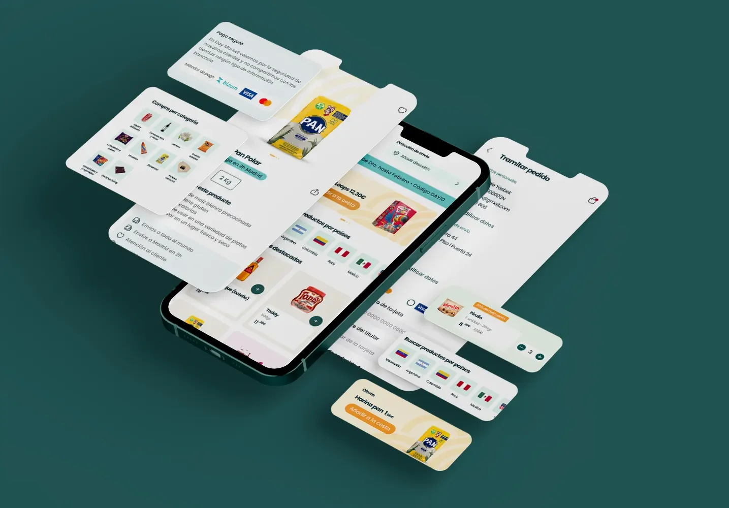
End-to-end ecommerce design for a Latin grocery store in Madrid that was managing an 80-page PDF catalog and orders through WhatsApp while serving customers at the counter.
Before
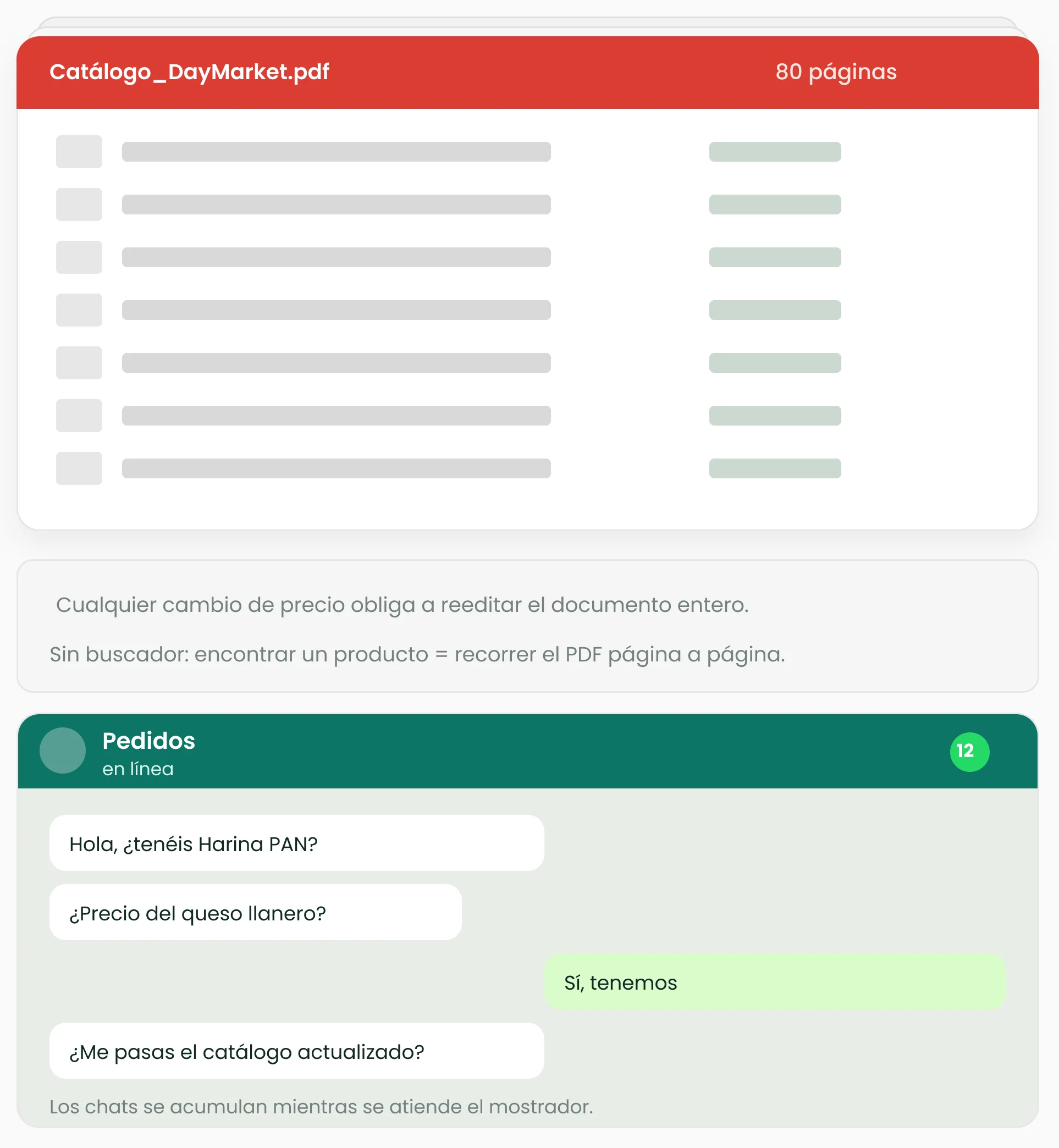
Attention split between the counter and the phone.
After
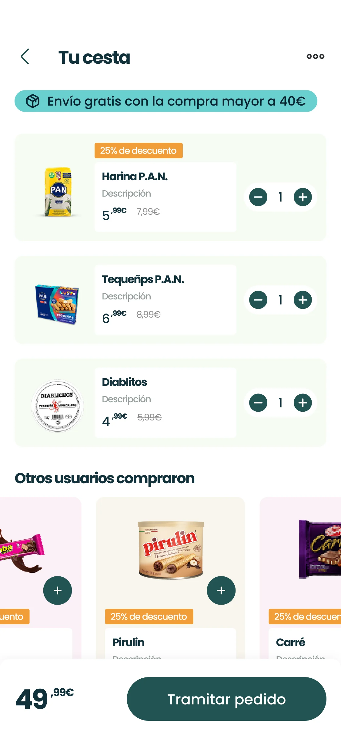
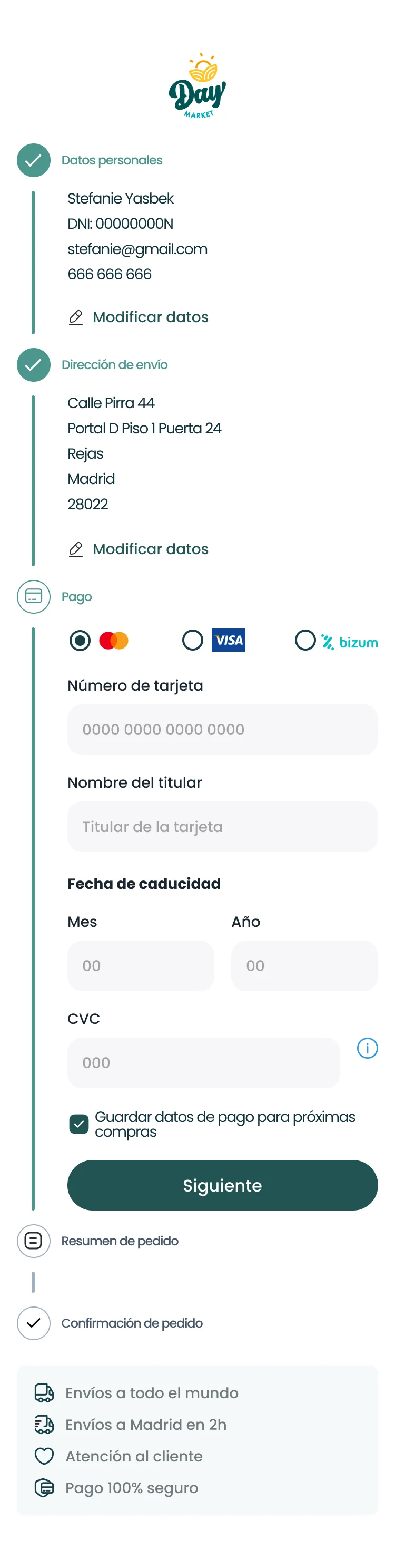
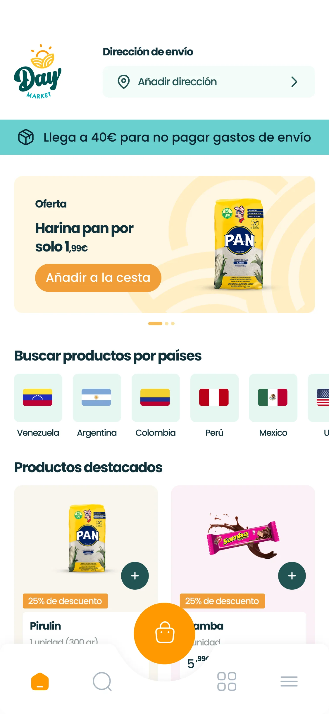
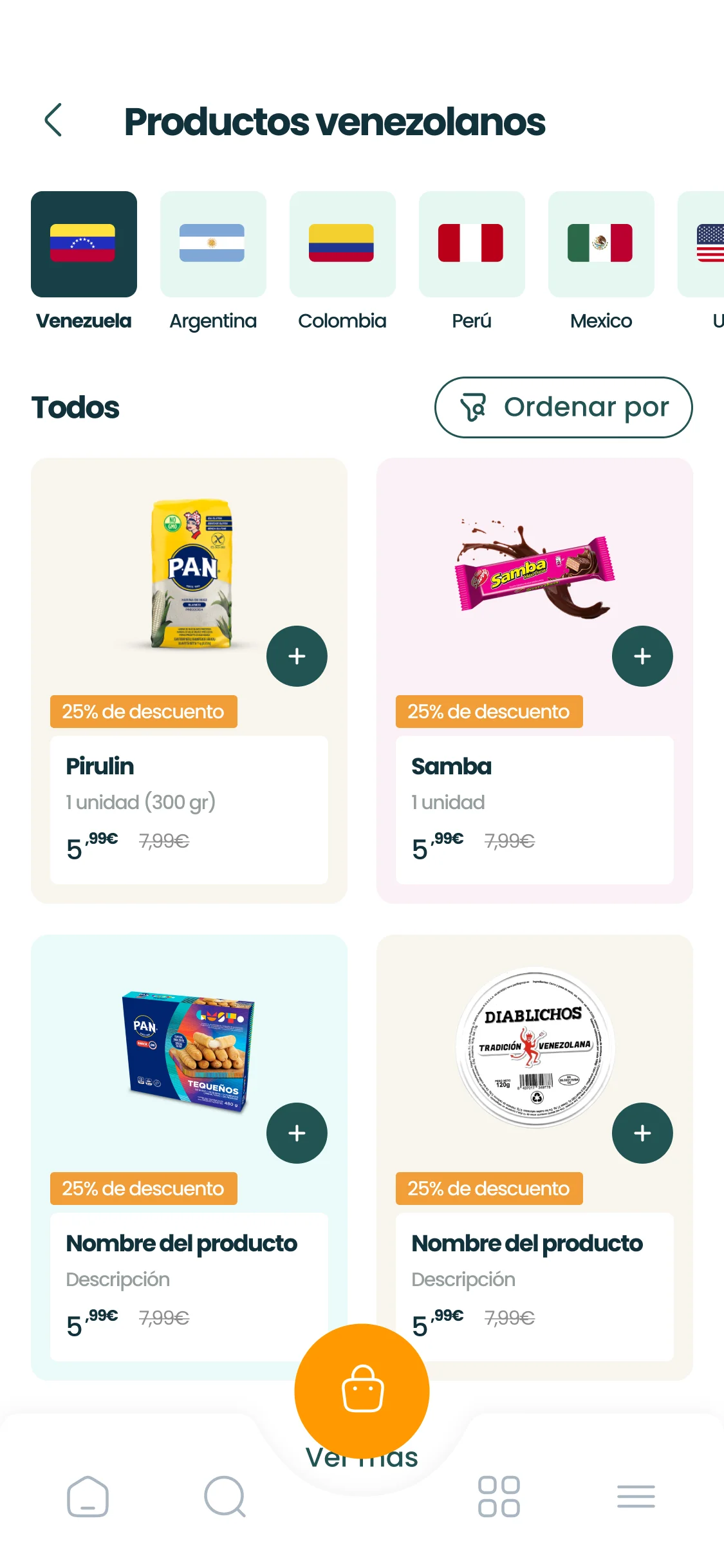
App design: country navigation and access to the catalogue.
B2C product · Ecommerce · End-to-end design · Built from scratch
Context
I worked as a freelance Product Designer, with end-to-end ownership: from understanding the problem through the complete UI and leading the handoff to development.
The client was the owner of a physical Latin grocery store in Madrid: a real, growing business already in operation. She was at once the client, the domain expert, and central to everything that followed: the person who would need to maintain the platform once it was built.
The product was conceived as a hybrid app, delivered in phases: the web was the first to ship, and it is the part operating today.
What I did
Discovery, flows, information architecture, the full UI in Figma, iteration on product pages and cross-selling, and being the continuity point throughout development.
What others brought
The owner brought the business knowledge, the catalog, and insight into how her customers bought. Implementation was handled by an external development role that, as explained below, changed several times.
The Problem
The owner was serving customers at the counter while managing orders through WhatsApp: attention split in two, with chats piling up out of control.
The catalog lived in an 80-page PDF. Any price change meant editing the entire document, so keeping prices up to date was unsustainable. And customers had no search: finding a specific product meant going through the PDF page by page.
As the business grew and orders multiplied, the manual method held up less and less. That was the trigger: order management was breaking under its own growth. Beneath it was a quieter need: the owner had to be able to add and edit products herself, without calling a developer for every change.
Process
Understand before drawing. I began by talking with the owner to see how she really worked: how she changed the catalog, how orders reached her, and what she needed to avoid depending on anyone for maintenance. Discovery was about understanding the real operation of someone selling and managing at the same time, rather than collecting a list of requirements.
Look for references where they existed. The direct “competition” was not useful as a reference: the few Latin-grocery ecommerce sites existed, but without solid design practices behind them. So I looked to general ecommerce and online supermarkets instead, because the core problem, searching, browsing products, cart and checkout, is one those products have already solved well many times.
AI as an accelerator for judgment. All the discovery material, conversation notes, references, and findings, risked becoming a pile of loose notes. I used AI to organize it, summarize the research, and prioritize actions and processes, turning the understanding phase into an ordered foundation for decisions rather than a drawer of chaos. The judgment of what to prioritize remained mine; AI removed the friction of sorting and gave me time back to decide.
A deliberate sequence. I designed the flows first, then the information architecture, and left UI until last. Resolving user movement and the catalog structure before touching the interface was a conscious decision.
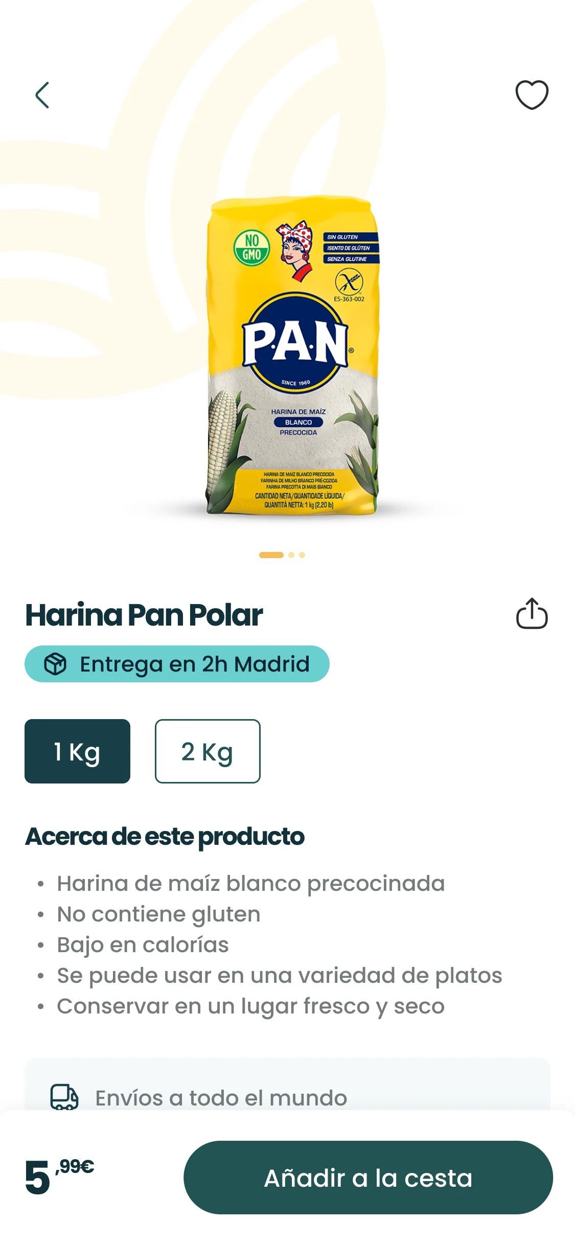
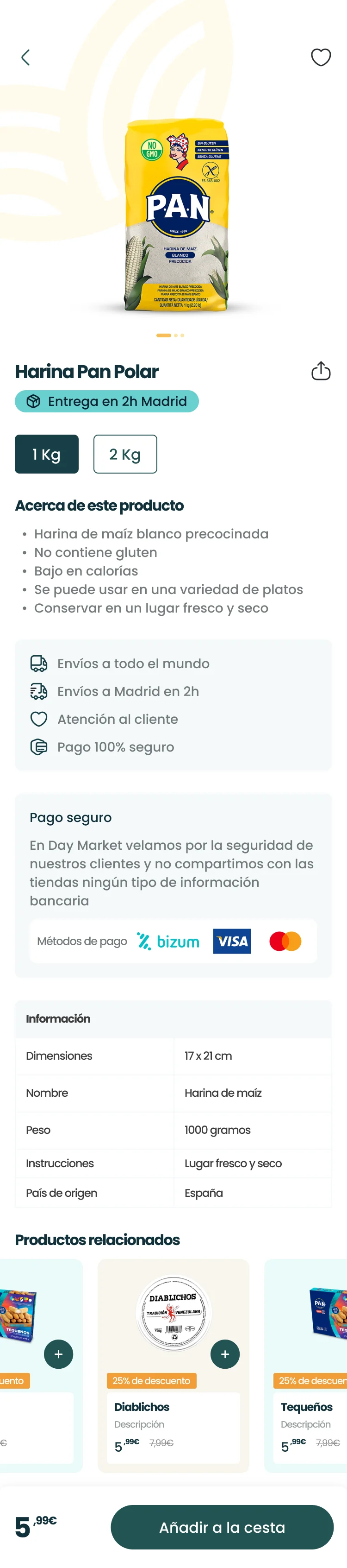
Iteration. The product page was iterated to improve information hierarchy and make room for cross-selling: letting one product open the door to others without overwhelming the view.
Handoff, the hardest part. We designed “blind” at a technical level because the developer joined after the design phase. From then on, development changed hands three times: one person left for personal reasons; another implemented components that were not faithful to the UI and had to be replaced. Every handover meant repeating meetings to bring the next person up to speed. I was the continuity point: the person holding the design judgment and context while implementation rotated.
Key Decisions
Design for the person maintaining the product, as well as the person buying from it
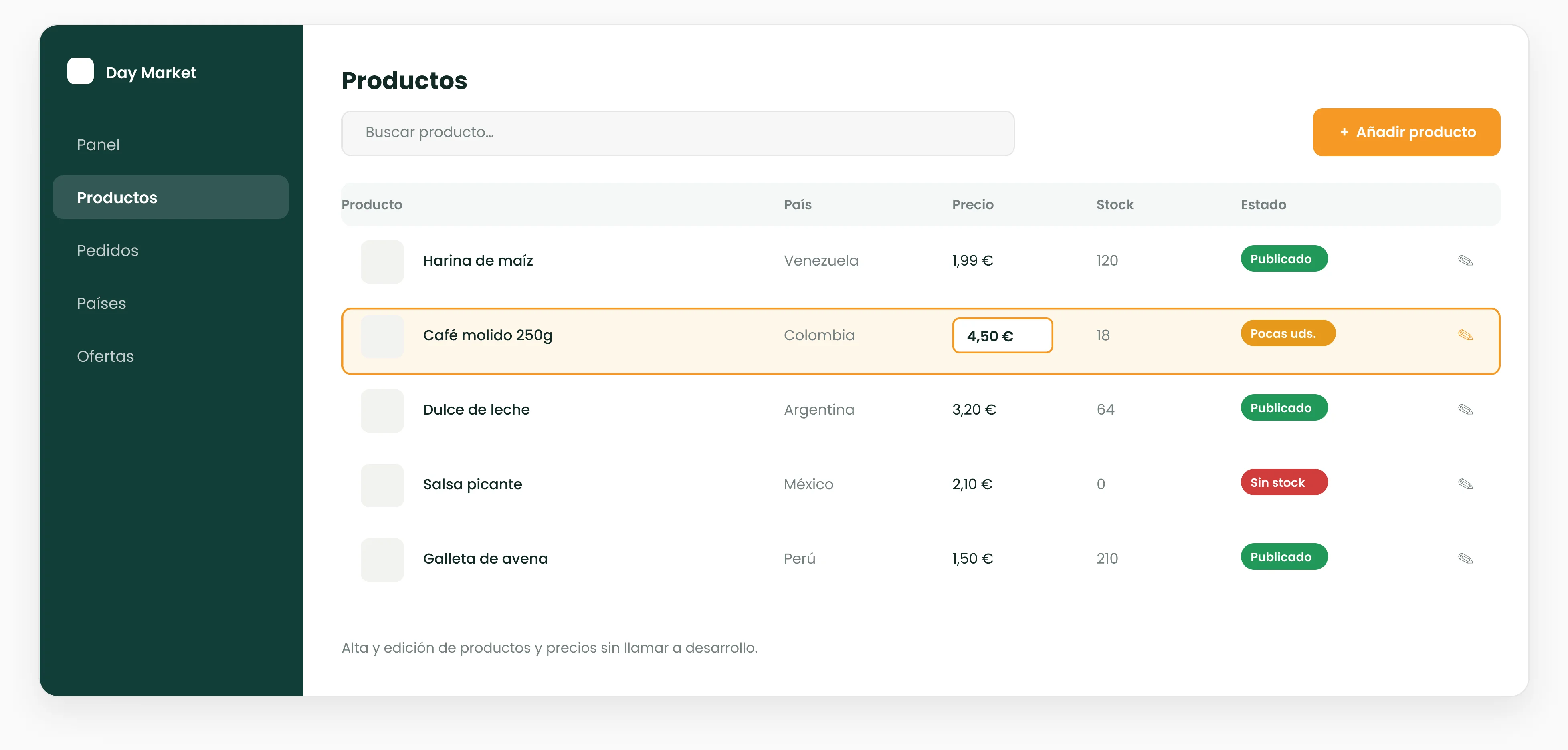
I prioritized the owner being able to manage the catalog, adding products and changing prices, without depending on a developer. Trade-off: a static catalog would have been faster and simpler to build, but it would have reproduced the PDF’s exact problem: relying on someone else for every change. I chose autonomy at the cost of more complexity because the business’s real pain was maintenance, more than aesthetics.
Use proven online-supermarket patterns, with country as a navigation axis
I based navigation, search, and checkout on proven general-ecommerce patterns rather than the existing Latin-grocery websites, and added an axis specific to the domain: browsing the catalog by country of origin, Venezuela, Colombia, Peru, Mexico, Ecuador, and more, as well as by product category. The reason is real behavior: most customers are Latin American and search by country first, because every culture has products that are not made elsewhere. Trade-off: relying on conventional supermarket patterns risked making it look like “just another supermarket”, and adding country as an axis increases navigation and catalog-maintenance complexity. I accepted both because niche references did not offer sound practices to follow, and because the country axis is precisely what makes the store recognizable and fast for the people who use it.
Browse by country
Flows and architecture before UI
I resolved how users move and how the catalog is organized first, and left the interface until last. Trade-off: with a non-technical client who wanted to see something “real”, showing flows and architecture is less visually compelling than showing finished screens, and it takes more work to sustain trust at that stage. In return, I avoided structural rework: changing the architecture after UI is assembled would have cost much more.
A dense but hierarchical product page, to make room for cross-selling
I iterated the page to include related products and work on average order value. Trade-off: every added element competes for attention and can bury the essentials, price, availability, and add to cart. I solved it with hierarchy: the buying decision first, cross-selling afterward, never ahead of it.
Design the complete hybrid app, even though delivery started with the web
The product was designed as a hybrid app, but the client’s budget meant starting the build with the web, so that was the first phase to ship. Trade-off: adjusting to the budget meant postponing part of the product and launching only a portion first; in return, the client could start selling sooner, on a design foundation intended for the whole product and not just the web. App development is now getting started.