Telecommunications · 2018-2019
X by Orange
UX/UI work on a pioneering SaaS ecosystem from Orange to digitalize SMBs: an ambitious product in a market that wasn't ready yet, where the real challenge wasn't technical but one of ambiguity and priorities.
X by Orange — pioneering SaaS for SMB digitalization · 2018–2019
A pioneering product, in a market that was not asking for it yet.
We were designing for a user almost nobody understood yet. The challenge was ambiguity and priorities, more than technical.
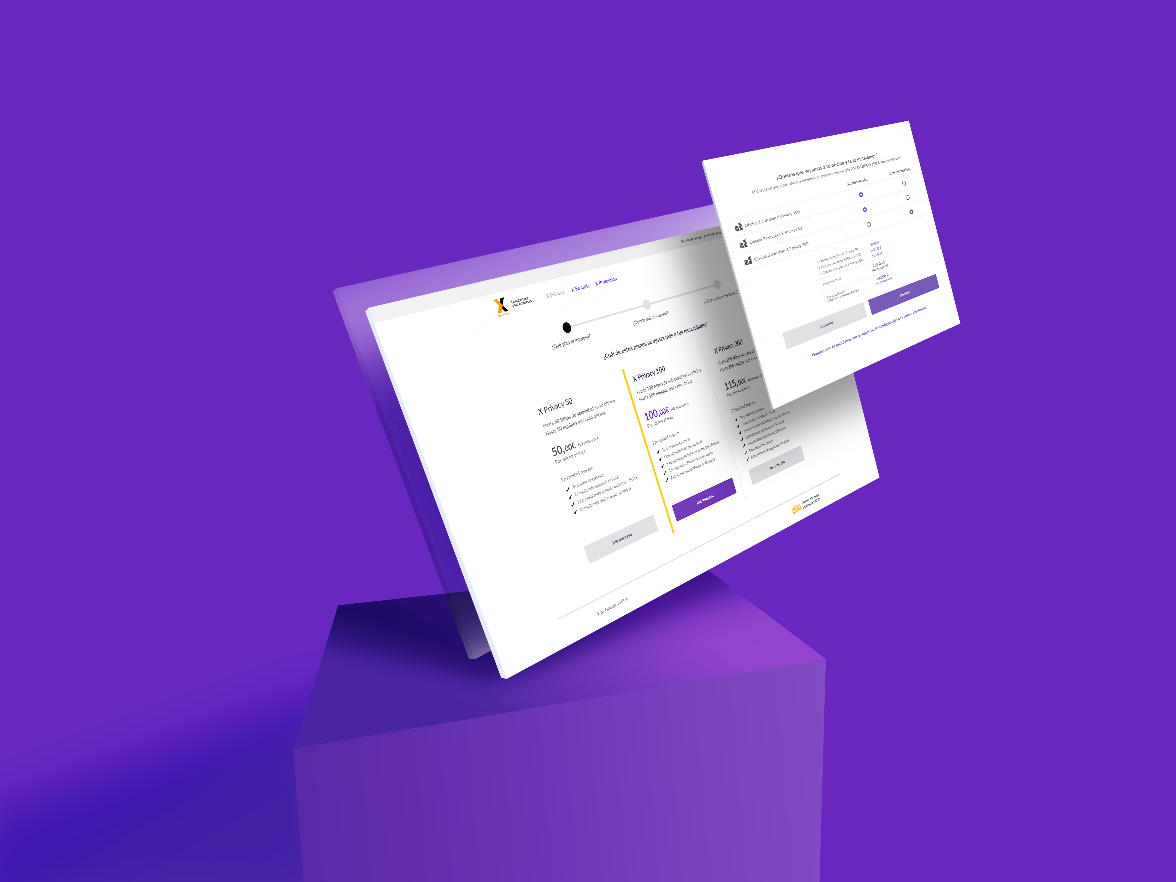
The screens in this case study are an illustrative recreation. The product no longer exists and is shown without real branding or data.
B2B product · Orange subsidiary · 2018–2019 · Team of ~8
Context
X by Orange was a subsidiary of Orange that sold digital products for business digitalization. An ambitious, pioneering project: there was barely any competition to learn from, and very little was known about the users.
It was an early stage in my UX/UI career: I joined as a junior profile and didn't lead — I contributed across several areas of the product within a team of about 8 people. The team rotated between areas instead of specializing narrowly, so everyone kept a global view of the product, and it was easy to understand what everyone else was working on and pitch in wherever needed.
What I did
Purchase and transactional flows, and the blog. With my background as a graphic designer, I also took on pieces the team didn't cover —user manuals and packaging for the devices (SD-WAN) that came with some of the ecosystem's services—. And I contributed to the design system at one specific point: the iconography and the documentation on how to build the icons, so any other designer could extend the library without depending on me.
Client: Orange. Timeframe: 2018–2019.
The Problem
The challenge in this project wasn't technical, it was ambiguity on two layers.
The first, market and user: it was a pioneering product, with barely any competition to learn from and very little real knowledge of the users. On top of that, digitalization was still not widespread among Spanish SMBs and freelancers at the time, and the products fit large companies better —while Spain is a country of SMBs. We were designing for a user almost nobody understood yet, in a market that wasn't asking for it yet.
The second, organizational: there was so much development on the table and such tight timelines that development's priority was the MVP taken to the extreme —doing everything at the bare minimum to avoid forcing deadlines, but with no review or iteration date, and a willingness to drop new work if it didn't look essential. Experience quality was, by default, under pressure.
X by Orange — organizational layer
The challenge was not technical, it was about priorities
Development priority · MVP to the extreme
- Everything minimal so as not to push deadlines
- No date set for review or iteration
- Willing to drop new development
Experience decisions I defended
- Guided onboarding for a complex dashboard
- Documented iconography so it scales without me
- Experience quality held under pressure
tension
Without imposing: finding solutions that were cheap to build (e.g. an onboarding overlay) and leaning on the relationship with development. Good relationships unblock solutions.
Process
With so little certainty about the user and the market, a good part of the work was about moving forward within that ambiguity and holding the line on experience against deadline pressure.
The team's dynamic helped: by rotating between areas, nobody lost the overall view, which made it easier to coordinate and cover for each other. My contribution was cross-cutting —purchase and transactional flows, the blog, and graphic design pieces like manuals and packaging— plus the iconography work and its documentation in the design system.
The main friction wasn't with the business side, but with development: the constant tension between the bare-minimum MVP, with no iteration date, and the experience decisions I was advocating for. That's where the case was actually won or lost.
(Given the project's timeframe, there was no AI-assisted work.)
Key Decisions
Defend the dashboard onboarding, and make it cheap to build
The user dashboard was complex, with several features that called for a guided walkthrough on first login —and the ability to request it again later. Development didn't see it as coherent and considered it complex to fit in. Trade-off: insisting on the onboarding added scope and workload that development didn't want to take on given the timelines. Instead of forcing it through, I worked with a front-end colleague to find a lightweight implementation (an onboarding overlay), and we struck a balance between what was needed and what was practical without overloading front-end. The lesson was as useful as the screen itself: good relationships and communication are what unblock solutions.
Document how the icons were built so the library could grow without me
Beyond drawing the iconography, I documented how to build it correctly for future additions. Trade-off: spending time on documentation wasn't rewarded by a bare-minimum-MVP culture; it was faster to just ship the icons and move on. I did it anyway because a library only I know how to extend doesn't scale: the documentation was what left the system in the hands of any designer who came after me.